When you display an image on a blog or webpage, should it have a high resolution for large desktop views or are you better of with a small resolution for on mobile devices? What is the impact of the image size on #SEO? Loading a large image and then down scaling it on smaller devices is not good and will impact your page speed and #SEO ranking negatively. What is the best solution here? What is the best average image size to use that will suit all situations?
Challenge: What is the best image size that will not impact my site's #SEO negative and will display at the best possible quality for my visitors browsing with different devices?
To be short: there isn't. Using an average image size will at most give your users an 'average' viewing quality and will likely still negatively impact your sites #SEO.
Image sizes, network speeds, device screen sizes and lately with mobile devices the screen dpi make selecting the perfect image size impossible: it will always be at most a compromise.
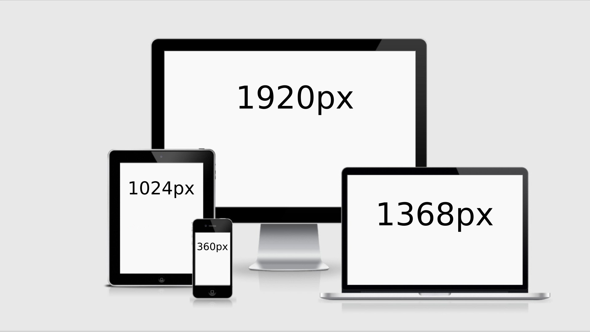
An image with a 1920px width will look good on a desktop with a 1920px display, it will also look good on all devices with a lower screen width, but Google will not be pleased: why use a large 1920px wide image on a device where the max image width is 360px?
An image with a width of 360px will load lighting fast and will be good for #SEO, and although the image looks great on mobile device with a screen with of 360px and dpi of 1, it will look blurred on larger screens as the image needs to be up scaled.
Solution: ochResponsiveImages
You are not the only one facing this challenge and the browser 'industry' came up with a solution: image source sets.
Why not offer multiple sizes of the images and let the browser decide what image is best suited for the device the user is visiting your site with?
So instead of serving one 'average' image, you serve multiple images, ranging from best fit for desktop to best fit for small mobile screens. Depending on the screen size, the screen dpi and the network speed, the browser will download the best possible image and display that to your visitor.
Enter the world of image source sets!
ochResponsiveImages will handle this for you automatically: no changes on your side needed, no more manually resizing images!
- you upload and insert the largest possible image into your blog or article (e.g. 3000px wide)
- ochResponsiveImages will create seperate images for each configured device width (e.g. 1920px, 1360px, 1024px, 768px, 460px, etc.)
- ochResponsiveImages will automatically replace the image code with the image srcset code, injecting all the created images
There are other solution that implement src sets when inserting an image into your blog, but there is one very big downside: what if you decide to change resolution, what if you decide to switch the template and you need different image size in the src set. Open all articles and reinsert the images with the correct src-set?...
ochResponsive images works 'on-the-fly'! when you change the resolution in the configuration, ALL article and blog images are directly converted to these new sizes and the src-sets are using this new setting!
Result: your site will look great and Google will love you (which is good for #SEO)
And even more, you finally have time to do more important things on your website than resizing and uploading images.
")