No bug responsive header image
- Hervé
-
 Onderwerp Auteur
- Offline
Minder
Lees meer
- Berichten: 121
- Ontvangen bedankjes 0
2 jaren 8 maanden geleden - 2 jaren 8 maanden geleden #2551
door Hervé
responsive header image werd gestart door Hervé
Hello Ruud
I hope you're having a good summer and are less bothered by the heat than in France?
Another question that may be at the limit of your plugin?
I'd like to put a header image (later with the transparent logo and the astroid theme menu) in the foreground.)
See: ascension.fr/ or www.altiplano-voyage.com/
I've tried several CSS solutions, but I'm not very satisfied because it doesn't look right on some screens or it's blurry
I've been given this other track to take into account all types of screens, but it's a bit complicated for me.
www.alsacreations.com/article/lire/1621-...e-images-srcset.html (FR)
I'd like to know if with a single webp image in the header, your plugin could take care of generating all the ccs to be responsive everywhere?
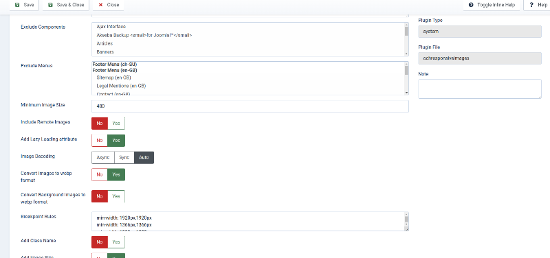
I've activated the options (see image) but if I reduce the screen size, I can't see anything.
Regards
I hope you're having a good summer and are less bothered by the heat than in France?
Another question that may be at the limit of your plugin?
I'd like to put a header image (later with the transparent logo and the astroid theme menu) in the foreground.)
See: ascension.fr/ or www.altiplano-voyage.com/
I've tried several CSS solutions, but I'm not very satisfied because it doesn't look right on some screens or it's blurry
Code:
#hs-1529472563843 { /* on met ici ce que l'on ne répétera pas */
background-repeat: no-repeat;
background-size: cover;
}
@media screen and (max-width: 23rem) { /* 23rem X16 = 368px minimum */
#hs-1529472563843 {
background-image: url("/0,medias/img/cordistes_toit_360-46.jpg");
}
}
@media screen and (min-width: 23.01rem) and (max-width: 119.99rem) {
#hs-1529472563843{
background-image: url("/0,medias/img/cordistes_toit_1366-177.jpg");
}
}
@media screen and (min-width: 120rem) { /* 1920px par exemple */
#hs-1529472563843{
background-image: url("/0,medias/img/cordistes_toit_1920-250.jpg");
}
}
I've been given this other track to take into account all types of screens, but it's a bit complicated for me.
www.alsacreations.com/article/lire/1621-...e-images-srcset.html (FR)
I'd like to know if with a single webp image in the header, your plugin could take care of generating all the ccs to be responsive everywhere?
I've activated the options (see image) but if I reduce the screen size, I can't see anything.
Regards
Laatst bewerkt 2 jaren 8 maanden geleden doorHervé.
Graag Inloggen deelnemen aan het gesprek.
- Ruud van Lent
-

- Offline
Minder
Lees meer
- Berichten: 1785
- Ontvangen bedankjes 116
2 jaren 8 maanden geleden #2552
door Ruud van Lent
Beantwoord door Ruud van Lent in topic responsive header image
Hi Hervé,
yes vacation was great, not to hot and not to rainy
I have moved your request to ochResponsiveImages support thread.
ochResponsiveImages doesn't generate css. It will replace the html <img> element it finds on a page with an <img srcset> element, that isit: nothing more / nothing less.
What you are trying to accomplish can best be done 'manually' via a (template) css file. Once you have figured out the correct / most optimal settings you are good to go. This is a single / one time task and not a repetitive task that benefits from 'automation' via a plugin.
regards,
Ruud.
Graag Inloggen deelnemen aan het gesprek.
- Hervé
-
 Onderwerp Auteur
- Offline
Minder
Lees meer
- Berichten: 121
- Ontvangen bedankjes 0
2 jaren 8 maanden geleden #2557
door Hervé
Beantwoord door Hervé in topic responsive header image
Hi Ruud
OK, I'll give it a try even though I'm having trouble getting started. Do you think I can do it with just one webp image?
I don't feel like multiplying images
Regards
OK, I'll give it a try even though I'm having trouble getting started. Do you think I can do it with just one webp image?
I don't feel like multiplying images
Regards
Graag Inloggen deelnemen aan het gesprek.
- Ruud van Lent
-

- Offline
Minder
Lees meer
- Berichten: 1785
- Ontvangen bedankjes 116
2 jaren 8 maanden geleden #2562
door Ruud van Lent
Beantwoord door Ruud van Lent in topic responsive header image
I think best to start with one image and when that is working see if you can or need improving. One of the improvements then could be to use a srcset with multiple images
Graag Inloggen deelnemen aan het gesprek.


