ochResponsiveImages - 12 months
ochResponsiveImages - The Easiest Way to Optimize Your Images for All Devices
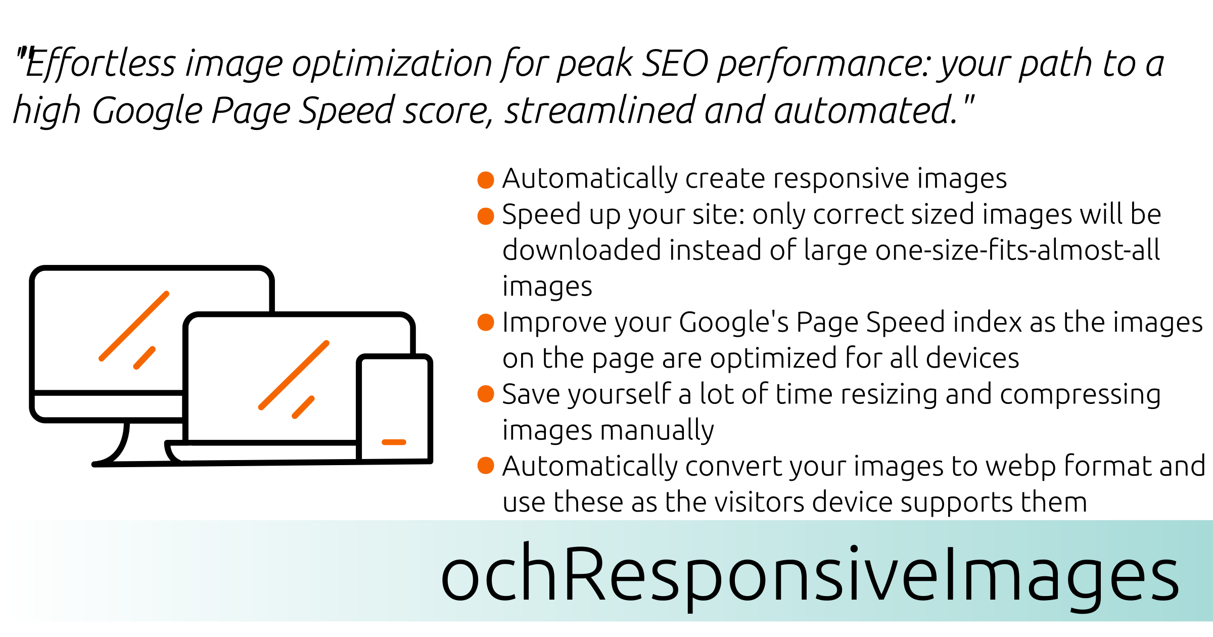
Are you struggling to optimize your images for all devices? ochResponsiveImages is the solution you've been looking for.
This powerful plugin automatically generates and serves optimized images for all devices, ensuring that your visitors only download the images they need. This can significantly improve your site's loading speed and performance, which are key factors in SEO.
ochResponsiveImages is also incredibly easy to use and provides deep control over optimization.
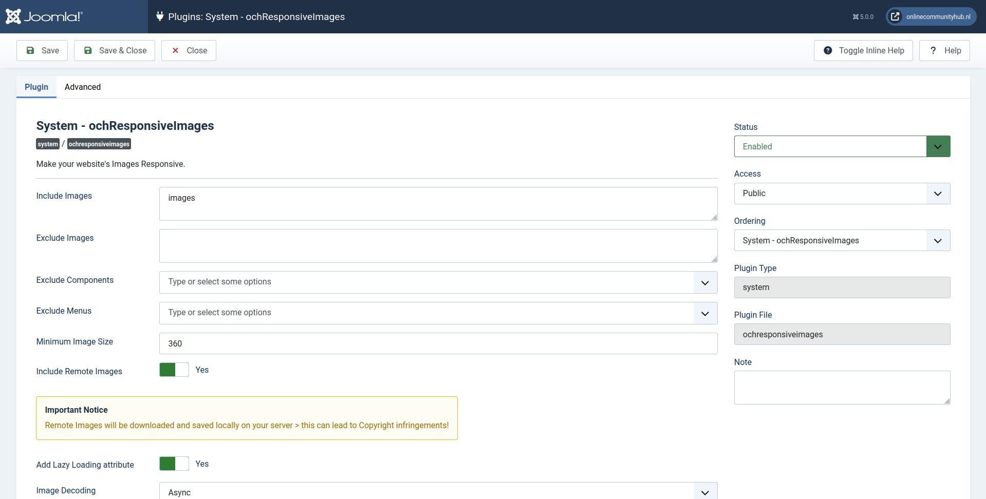
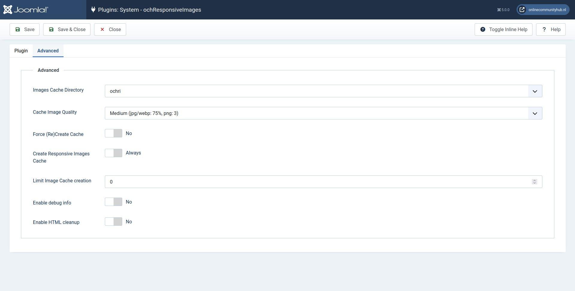
Simply install the plugin and configure your set of breakpoints (the sizes for the devices you want to support). For each breakpoint, an optimized image will be automatically generated and cached. Your original image will then be replaced with an HTML srcset containing all of the cached images.
Furthermore, for pages that require specific optimization, you can easily override the general settings on a per-page basis using the dedicated configuration tab found within the Joomla Menu Manager. This powerful feature allows you to ensure pixel-perfect performance and configuration for every unique landing page or critical piece of content.
When a visitor visits your site, their browser will automatically select the image from the srcset that is best suited for their device. This ensures that your visitors always see the highest quality image possible, regardless of the device they are using, while giving you the flexibility to manage performance at a granular level.
Benefits of ochResponsiveImages:
- Speed up your site: ochResponsiveImages can significantly improve your site's loading speed by serving optimized images for all devices.
- Improve your Google's Page Speed index: ochResponsiveImages optimized images are smaller and faster loading, which can lead to a significant improvement in your Google's Page Speed index. This can help you improve your search engine rankings and visibility.
- Gain Granular Control: Easily override general settings for any individual page via a dedicated tab in the Joomla Menu Manager, allowing you to fine-tune optimization strategies for critical content and landing pages.
- Save you a lot of time: ochResponsiveImages eliminates the need to manually resize and compress your images for different devices. This can save you a significant amount of time, especially if you have a large number of images on your site.
- Convert your images to WebP and or AVIF: ochResponsiveImages can automatically convert your images to the new WebP and or AVIF next-gen image format, which is supported by all major browsers. WebP and or AVIF images can be up to 30% smaller than JPEG images without any loss in quality.
- Automatically add decoding and width/height attributes: ochResponsiveImages automatically adds the necessary decoding and width/height attributes to your images, which can help to improve your site's performance and prevent CLS (Cumulative Layout Shift).
- Language support: ochResponsiveImages comes out of the box with support for multiple languages, including English, French, german, Spanish, Polish, Serbian, Turkish, and Dutch. You can also create or improve your own language translation on Transifex.
Guarantee
We are so confident that you will love ochResponsiveImages that we offer a 100% satisfaction guarantee. If you are not happy with the plugin for any reason, simply contact us and we will refund your purchase price.Benefits of a Subscription
- Download ochResponsiveImages plugin
- Get notified of and download future ochResponsiveImages updates
- Automatically keep ochResponsiveImages up to date > Get a Download ID to use in the Joomla! One click Updater
- Request support on our forum
- Propose / discuss new functionality
Order your subscription to ochResponsiveImages today and start optimizing your images for all devices!
Testimonials
Joomla! 6 Joomla! 5 Joomla! 4 (EOL - Not supported) Joomla! 3 (EOL - Not supported) PHP 8.1+
| Security updates | Free Available to all licence holders within the support period, including expired subscriptions. Temporary download access (30 days) is activated for all license holders on the day of release. |
| Bug fixes & improvements | Active subscription Available to customers with an active subscription. |
| New features | Active subscription Available to customers with an active subscription. |
| End-of-life platforms | Not available Security updates are not backported to Joomla or PHP versions that have reached end of life. Customers on unsupported platforms are advised to upgrade. |
 |
EU Declaration of Conformity - ochResponsiveImages |
| Manufacturer | OnlineCommunityHub, Netherlands |
| Product name |
|
| Supported series |
|
| Product description | Joomla extension - regular product with digital elements |
| CRA product class | Regular product (CRA Annex III not applicable) |
| Conformity procedure | Self-assessment - Article 32(1), Regulation (EU) 2024/2847 |
| Supported platforms | Joomla! 6 Joomla! 5 Joomla! 4 (EOL - Not supported) Joomla! 3 (EOL - Not supported) PHP 8.1+ |
| Support period | Minimum 5 years from date of first purchase |
| Regulation Regulation | (EU) 2024/2847 of the European Parliament and of the Council |
Software Bill of Materials (SBOM)
No third-party libraries bundled with this extension.
| Library | Version |
|---|---|
| - | - |
See our vulnerability disclosure policy or report directly via the contact form.
[Gallery created with ochGlightbox]