")
")
No bug I can't configure it correctly or it doesn't work
- ALFONSO FRANCES
-
 Topic Author
- Offline
Less
More
- Posts: 4
- Thank you received: 0
I can't configure it correctly or it doesn't work was created by ALFONSO FRANCES
Hello
I have installed the plugin with the default settings and it doesn't work for me. Resize the images without criteria that I can understand.
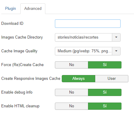
Attached screenshots of the configuration. I have activated the debug info mode so you can give me a solution. The web is madridactual.es
I am waiting.
Thank you
I have installed the plugin with the default settings and it doesn't work for me. Resize the images without criteria that I can understand.
Attached screenshots of the configuration. I have activated the debug info mode so you can give me a solution. The web is madridactual.es
I am waiting.
Thank you
Last edit: 3 years 9 months ago by ALFONSO FRANCES.
The topic has been locked.
- Ruud van Lent
-

- Offline
Less
More
- Posts: 1481
- Thank you received: 100
Replied by Ruud van Lent on topic I can't configure it correctly or it doesn't work
Good morning,
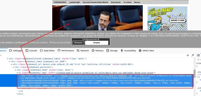
I have checked your site and looked at the first image I saw. I can see that this is handled correct by ochResponsiveImages as you can see in the screencapture.
Please note that on first visit of the page, ochResponsiveImages creates the converted responsive images but it will not use them.
on the second visit of the page (F5) you will see that ochresponsiveImages will replace the <img> with the new <img srcset (as you can see in the image).
Also, the setting 'force create cache' will slow you site down because it will on every visit recreate the cached images. This setting you can you if you upload a new image with the same name: it will then recreate the cached files for that image.
The topic has been locked.
- ALFONSO FRANCES
-
Topic Author
- Offline
Less
More
- Posts: 4
- Thank you received: 0
Replied by ALFONSO FRANCES on topic I can't configure it correctly or it doesn't work
yes, but note that you don't enter the correct cutout. If you open the image in a new window, no crop is shown, but the maximum size of the image.
I expected the image shown to be that of the cutout, which in each place should be different.
Isn't this how the plugin works?
for example, in the madridactual.es header image (the first one) it should appear as a 650 px cutout
I expected the image shown to be that of the cutout, which in each place should be different.
Isn't this how the plugin works?
for example, in the madridactual.es header image (the first one) it should appear as a 650 px cutout
Last edit: 3 years 9 months ago by ALFONSO FRANCES.
The topic has been locked.
- Ruud van Lent
-
- Offline
Less
More
- Posts: 1481
- Thank you received: 100
Replied by Ruud van Lent on topic I can't configure it correctly or it doesn't work
What it does is convret an <img> element to an <img srsset> element.
so when your site has the following:
<img src="path/image.jpg">
it will create for each configured break-point cached images, e.g.
image480px.jpg
image786px.jpg
image1200px.jpg
etc.
it will then replace the <img> element with the srcset variant.
This new img element will enable the browser to take the image it seems best fit.
So when browsing from a mobile device, the browser will download and display the small image480px.jpg, when on desktop it will download and use the image1200px.jpg
That is the basic functionality that will give the most gain in page speed (#seo) as Google will applaud you for not serving the generic-one-size-fits-all-image (image.jpg) to browser: wasting bandwidth when the image needs to downloaded in full, but only shown shrinked to e.g. 480px
So the images are replaces as-is. the cached images are exactly the same (crop) as the original image as that is taken as source, only the resolution is different.
When you enabled WebP conversion, the cached images are created in two formats: the original format (.jpg) and the WebP format, so
image480px.jpg and image480px.webp
when the browser supports webp the the webp will be served (which is a lot smaller retaining the same quality), when the browser doesn't support, the jpg image is served
As for your question:
the cutout 9cropping) can be done in two places:
1. on the image itself (you use a cropped image and that image will then be used as the cached images)
2. via css.
ochResponsiveImages works with the HTML elements that are on the page, so it has an image filename to work with. Things that are done to that image client-side via css is 'unknown' and cannot be handled.
When you disable ochResponsiveImages and the open the image, you will see the same image cropping / size / ratio / etc. then when you have enabled ochResponsiveImages.
Does this answer your question?
The topic has been locked.
- ALFONSO FRANCES
-
Topic Author
- Offline
Less
More
- Posts: 4
- Thank you received: 0
Replied by ALFONSO FRANCES on topic I can't configure it correctly or it doesn't work
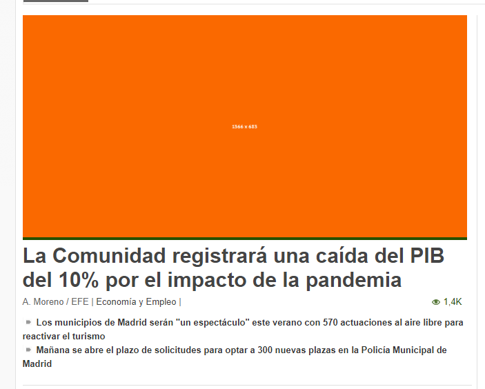
and the screenshot that I attach in which indicates that the image is 1366 px wide, shouldn't it indicate 650 px wide which is the cutout that corresponds to the size defined in that image?
Last edit: 3 years 9 months ago by ALFONSO FRANCES.
The topic has been locked.
- Ruud van Lent
-
- Offline
Less
More
- Posts: 1481
- Thank you received: 100
Replied by Ruud van Lent on topic I can't configure it correctly or it doesn't work
Hi,
that is the 'beauty' of it, but this can be somewhat confusing.
So the browser decides what image size is best. If you are e.g. on a mobile device with a device width of 480px and a dpi of 2, then the broser on that device will look for an image that is 2 x 480 px wide = 960px
When you look the same page on a high-spec mobile with dpi = 3 then the browser will look for an image size 3 x 480 = 1440px
So this is actually a good thing as the 480px image with the same widt on the screen would look less sharp then the 960px image shown with dpi = 2.
For google the only thing that counts is that you offer different sizes for different 'break-points': google then 'knows' that you are not offering a 2100px image that will be displayed at 960px (because that is a waste of bandwidth)
The topic has been locked.
- ALFONSO FRANCES
-
Topic Author
- Offline
Less
More
- Posts: 4
- Thank you received: 0
Replied by ALFONSO FRANCES on topic I can't configure it correctly or it doesn't work
ok. Thanks a lot!
The topic has been locked.
- Ruud van Lent
-
- Offline
Less
More
- Posts: 1481
- Thank you received: 100
Replied by Ruud van Lent on topic I can't configure it correctly or it doesn't work
You are welcome!
If you have any other questions, feel free to ask!
If you have any other questions, feel free to ask!
The topic has been locked.